 Studio Elena

Flavour from the Amalfi Coast.
A tiny eight-table osteria imagined into the fishing village of Cetara on the Amalfi Coast — Italy’s anchovy capital, where the catch is sorted by hand at dawn and
lemons ripen on the terraces above.
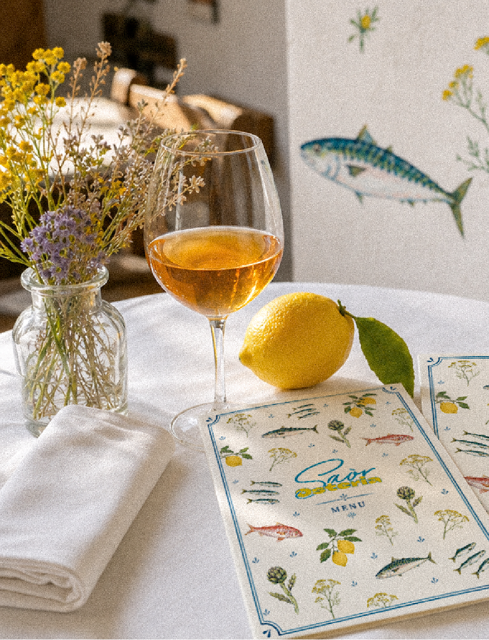
The name Saòr, Venetian dialect for “flavour,” nods to the sweet-and-sour cure fishermen once used to keep the catch. The identity turns that world into a hand-painted language — sardines, lemon branches, grapes and wild flowers scattered across white, bright because the coast itself is.
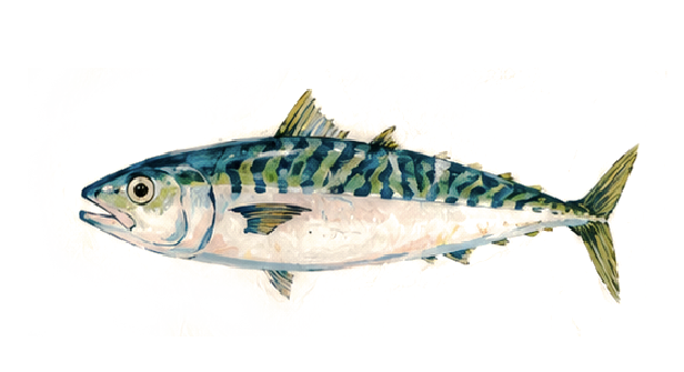
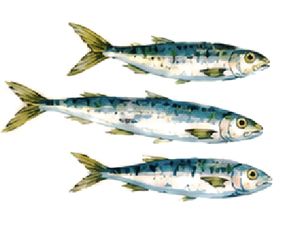
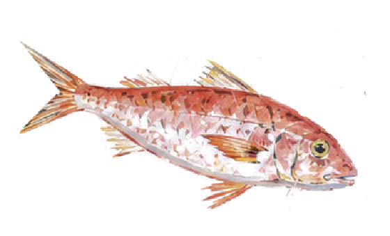
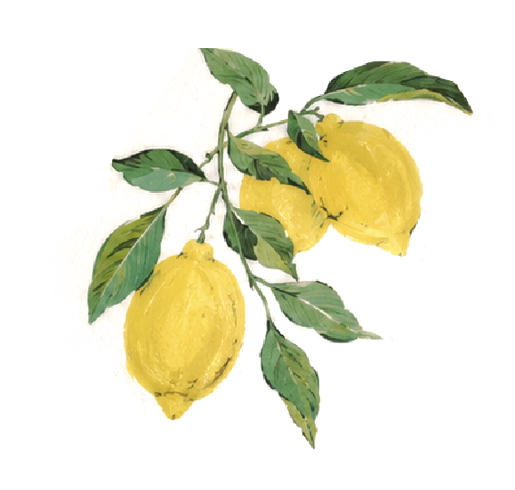
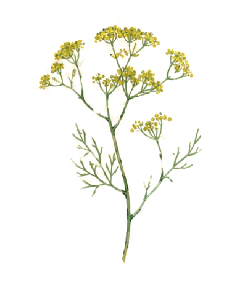
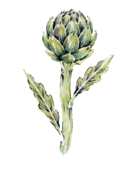
I built the identity around a single idea: let the coast set the colour. Rather than reuse a generic seafood look, I hand-painted an original set of watercolour illustrations — mackerel, sardines, red mullet, Amalfi lemons, fennel and artichoke — the real produce of Cetara, in a bright, naïve, market-fresh style. These paintings became the system: the wall murals, the menu border, the ceramics and the packaging all grow from the same hand.
A short, market-led menu: day-boat fish, tinned anchovies, Amalfi lemon and natural wine.
It changes every day with the catch.
Eight tables between the mountain and the sea. Whitewashed walls, brass, glass and hand-painted fish — the room is kept plain so the food and the sea carry the colour.
Hand-painted illustrations
Every motif hand-painted for Osteria Saòr — no stock, no repeats.

What we created
A complete visual identity for Osteria Saòr — a bright, hand-painted world drawn entirely from the produce of Cetara. From the logo to the last napkin, every element grows from one set of original watercolour illustrations.
- Brand concept & naming direction
- Two-colour logo & wordmark
- Original hand-painted illustration set
- Colour palette & typography
- Menu design — cover & inside, in Italian, priced in euro
- Interior visual language & wall murals
- Packaging, ceramics & tableware direction
- Signage & storefront
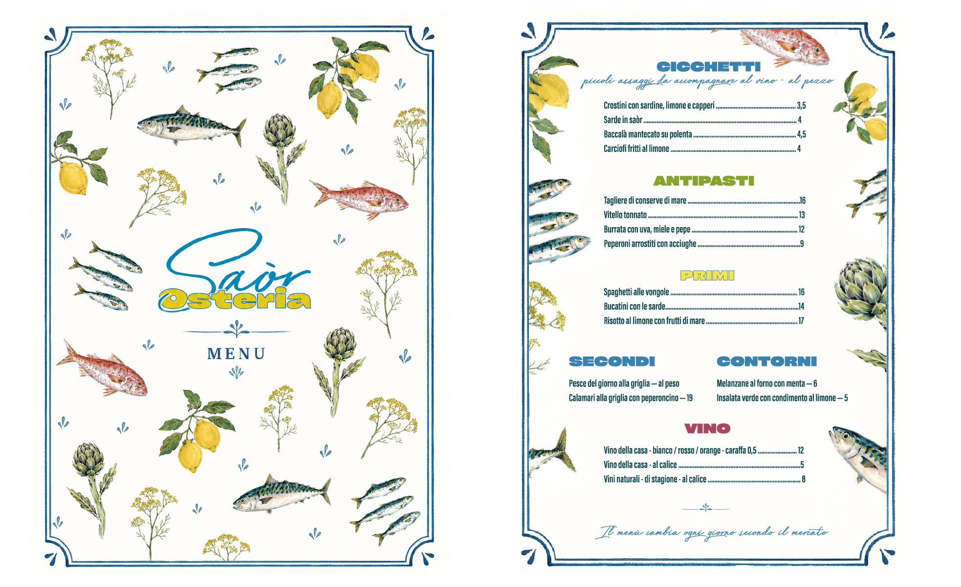
The menu carries the identity: a botanical
border of fish and citrus, the two-colour
wordmark, and prices in euro. Printed
on warm off-white stock, refreshed daily.